Tag: art

We interrupt this broadcast

It was perhaps the strangest 60 minutes that this oversized, traffic-choked television has ever seen.

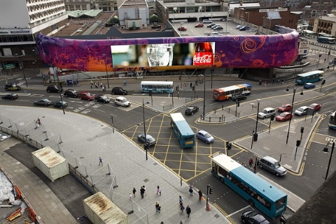
Overlooking the tumbling river of vehicles that flows between Liverpool’s Lime Street Station and the exquisite St George’s Hall, the 31-metre long Media Wall usually plays host to a constant cycle of ads. However, for one hour only on January 20th 2016, its consumerist mantra was interrupted by the Four Words art project – a stream of slogans, thoughts, non-sequiturs and questions on the theme of money, value and exchange.

Conceived by the artist Alan Dunn, and forming part of the Liverpool Provocations series, the anti-ads were provided by an eclectic list of artists, writers, economists, journalists, musicians and community activists – not to mention the odd creative copywriter. Each contributor was required to submit four words together with instructions for a ten-second text animation; on the day, the 70-ish syntactical snippets were aired three times each, and once the hour was up, normal commercial service was resumed.

At the very least, Four Words threw a linguistic spanner into capitalism’s works for an afternoon during the January sales, provoking plenty of puzzlement and, perhaps, a little inspiration for the city’s passing workforce.

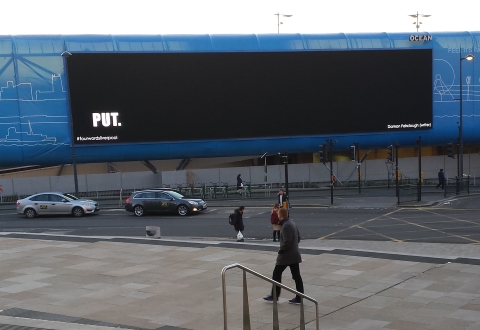
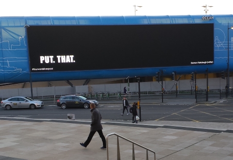
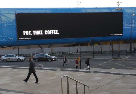
As revealed on this very blog back in December, I was one of the contributors invited to take part in this intriguing intervention. When I originally trailed my involvement, I kept my four-word slogan under wraps, but now my story can be told. Here goes:Four Words, Liverpool - Damon Fairclough 1

Four Words, Liverpool - Damon Fairclough 2

Four Words, Liverpool - Damon Fairclough 3

Four Words, Liverpool - Damon Fairclough 4

So there you have it: PUT. THAT. COFFEE. DOWN!

This isn’t the time or place to go into the what-and-why of that caffeinated call to action – I’ll save that for an article on my writing archive at noiseheatpower.com sometime soon. For now, let’s accept it at face value – just one four-word utterance among the many that caused Liverpool to raise an eyebrow one chilly January afternoon.

I’d like to express huge thanks to Alan Dunn for issuing the call, to Jack Ehlen for executing the animation, to my fellow four-worders, and to Metal Liverpool who put so much work into helping the whole thing happen. The event was well documented in both photographs and video, so those who have the time and/or inclination can gorge themselves on these literary snacks while reliving the whole provocative experience. Without having to endure the biting wind.

And if any of the organisers are reading this, I’m ready to do it all over again whenever you want.

In fact, let’s go crazy. Next time, let’s make it five.


Watch interviews and clips from the day…


…or watch the full 20-minute Four Words cycle

Facebooktwitterredditpinterestlinkedintumblrmail

Human after all: how a copywriter’s dream came true

When I took the first steps on my freelance copywriting journey back in March (first steps as a freelancer that is; as an agency copywriter, I’d already circumnavigated the marketing globe) I had a few modest goals in mind.

Naturally, I wanted to do great work for wonderful clients, helping them achieve big things through the power of well-picked words. I also quite fancied seeing inside a bunch of agencies and businesses having previously been at the same desk for <mumble mumble> years. And, ultimately, I hoped to earn enough cash to ensure that beans-on-toast remained a snack rather than a staple, and to afford the odd bottle of very strong, eccentrically-hopped craft ale.

Modesty and/or shame forbid me from detailing the ways in which I may or may not have hit these targets, so instead, let me round off 2015 by talking about one project I would never have dared hope might come my way.

The Human approach

Sheffield’s Human Studio is one of the creative outfits I’ve followed from afar for years. Another would be the unfeasibly influential Designers Republic – the same studio where Human founder Nick Bax worked for 17 years. Another favourite of mine is Build, founded by Mike and Nicky Place after Mike left, erm, the Designers Republic. There’s a theme, certainly.
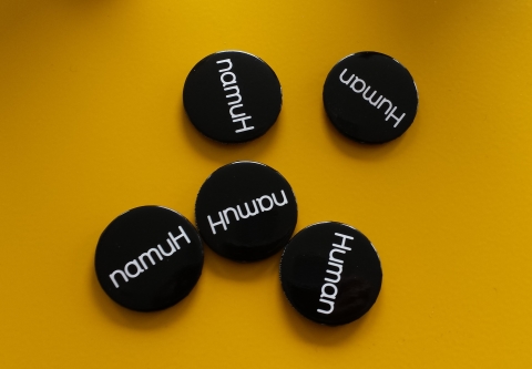
Human Studio badges

I say I’ve followed Human from afar, but in fact it has sometimes been from quite close. When I created a sci-fi backstory for the Sheffield electronic music label Central Processing Unit, it was Human who were creating the label’s super-minimal branding. I’d met Nick Bax too, once upon a lifetime ago, when I was creative writer at the games developer Psygnosis, and the Designers Republic were working with us on the game Wipeout.

But although we were known to each other, Nick Bax’s email in June this year still came as a surprise. He wanted to know if I was interested in working with Human on a project – an exhibition catalogue springing from their work with a gallery in Tokyo.

As an ad industry professional, I felt I should perhaps remain calm and measured in my response. As a hopeless fanboy, I felt I should perform the email equivalent of a high-five while simultaneously punching the air.

Guess which side of me won.

Sheffield to Tokyo

The job was briefed one memorable afternoon in July when I travelled to Human HQ in Sheffield’s Park Hill flats. (I could take this story down another diversion at this point, as those flats have exercised my thoughts on many occasions over the years, not least in this recent interview with the painter Mandy Payne.) Nick explained that they were planning to create a collection of 3D objects for the exhibition – sculptures I suppose – but that instead of transporting them to Tokyo by air or sea, the objects would be sent as digital files to be 3D printed at an event in the Calm & Punk gallery.
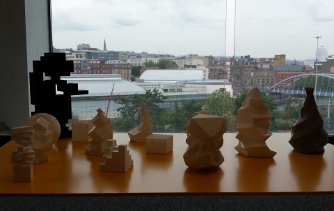
3D objects by Human Studio

So what was required for the introduction to the Human catalogue? Nick was pleasingly, yet also worryingly, vague. I inferred that he didn’t want a conventional studio biography or ‘explanation’ of what the work was about, and that was a good thing. On the other hand I felt the tantalising creative terror that comes when you know something is expected of you, but you’re not entirely sure that you’ll be able to work out what it is.

However, all the best projects begin that way, and my thoughts were duly set in motion.

I won’t detail the night sweats, mood swings and general creative thrashing around that accompanied my efforts to come up with an executable idea. Suffice to say, I delivered the goods on time and, six or so weeks later, I had colonised the first six pages of the exhibition catalogue, in English with side-by-side Japanese translation.

The storytelling urge

My piece was a short story about matter transference – or rather, about the way that the transfer of physical objects between Sheffield and Tokyo might evolve over the years. It took the form of three conversations: the first was concerned with events 40 years ago when a friend’s dad brought a calculator back from Japan; the second detailed Human’s use of 3D printing in the present day; the third speculated about where this technology may lead – in this fictional case, to the transference of humans at the press of a button.
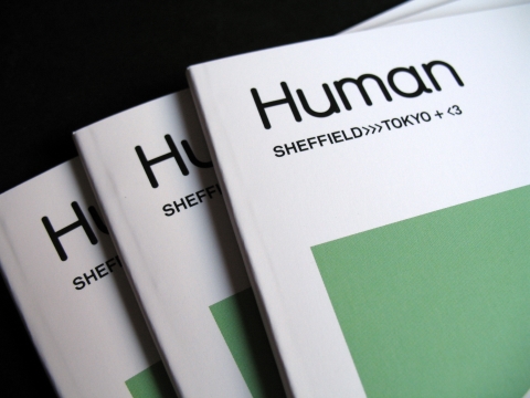
Sheffield>>>Tokyo+<3 catalogue cover, Human Studio

The exhibition, called SHEFFIELD>>>TOKYO+<3, took place in October 2015: the files were delivered, the objects were printed, the gallery put them on display. The catalogue is slim and seductive; it is beautifully designed, of course, and adds context without over-explanation. If the objects and their mode of delivery raise questions, the catalogue doesn’t answer them; rather, it raises a few questions of its own.

For me, working with Human Studio and creating this piece remains one of 2015’s biggest thrills. Had I allowed myself to believe that work like this might come my way, it’s exactly the kind of job I’d have dreamt up. It’s my hope that this kind of storytelling – not a world away from the kind of work I was doing 20 years ago with Psygnosis – feeds back into every project I’m involved with, as even the most functional copy can come alive when you add a little storytelling magic.

As I said, that’s my hope. It’s for my clients to decide whether it’s what I achieve. But it’s what I’ll continue striving for as my professional odyssey continues in 2016, and my tentative freelance steps become giant creative strides.
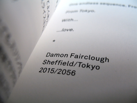
Sheffield>>>Tokyo+<3 catalogue, Human Studio


You can read more of my words about Sheffield’s Designers Republic here.

Facebooktwitterredditpinterestlinkedintumblrmail

Four word march

Not every ad line needs to be compact, concise and considerably shorter than War and Peace, but brevity is often what’s required. As a copywriter I’ve written my share of snappy straplines in my time and they’ve appeared around the world in all kinds of very public manifestations. I’m not sure, however, that any have claimed ten seconds of fame on quite the scale of my most recent slogan.

Its precise wording must remain under wraps for now, but what I can reveal is that on January 20th 2016, four of my words will have Liverpool’s gargantuan media wall to themselves… for one whole sixth of a minute. It’s an exciting prospect, as the screen sits in a prominent position opposite Lime Street station, and claims to be “the largest full motion out-of-home digital advertising screen in Europe”. (At almost 31 metres long, if there’s an “in-home” screen that’s bigger, I’d be very interested to see the residence in question.)

Liverpool media wall

On this occasion, the slogan won’t be a component of an ad or marketing campaign, but will instead form part of a project curated by the artist Alan Dunn. The initiative, called Four Words, aims to take over Liverpool’s most visible city-centre advertising site in the middle of the sales season and offer shoppers 100 different four-word thoughts based on ideas of value, money and exchange. In the words of the brief: “We want to offer the Liverpool public FOUR WORDS that will act as a counterpoint to the sales season and the invisible pressures of this time of year.”

It may be the height of hypocrisy for a commercial copywriter of many years’ standing to get involved in an art project that is essentially a critique of the free market and its post-Christmas shopping frenzy, but a brief is a brief. When invited to take part, I certainly couldn’t resist the opportunity to see four of my carefully weighted words appear giant-sized in the centre of the city, but equally, it will be a real thrill to appear alongside some very noteworthy co-contributors including Douglas Coupland, Gerhard Richter, Paul Morley, Jamie Reid and David Shrigley.

Plus, I’m sure it will be exhilarating for them to be on the same list as the famous Liverpool-based copywriter and content creator, Damon Fairclough. (Incidentally, there’s another D. Fairclough on the list too – the sensational Liverpool FC super-sub of the 1970s and early ’80s…)

With each four-word sequence currently being animated by the designer Jack Ehlen, the Lime Street stage is set for 100 curious comments that will command Liverpool’s attention in just a few weeks’ time.

As I said, I can’t tell you my slogan just yet.

But I’m looking four word to it.


Four Words appears on the Lime Street media wall in Liverpool on Wednesday, January 20th 2016 between 3pm-4pm.

It is part of the Liverpool Provocations series developed by Metal Liverpool.

Facebooktwitterredditpinterestlinkedintumblrmail